You are currently browsing the tag archive for the ‘Art’ tag.
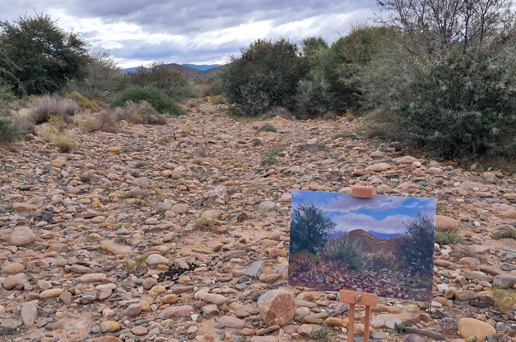
Winter in the Klein Karoo. I am walking through open country, towards the Touws Rivier. The beechwood easel is slung over my shoulder and little Cleo is trotting up front. I’m heading for a small cliff that I may like to paint. It feels right, moving through the stones and scrub, with the odd cloud scudding overhead. It takes a while to settle on something – I am spoilt for choice and can’t decide. There’s no water in the river, and the riverbed is what I settle on. The view up the riverbed, with the stones and the dark shadow under that acacia tree is what catches my eye.
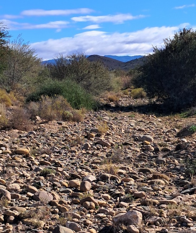
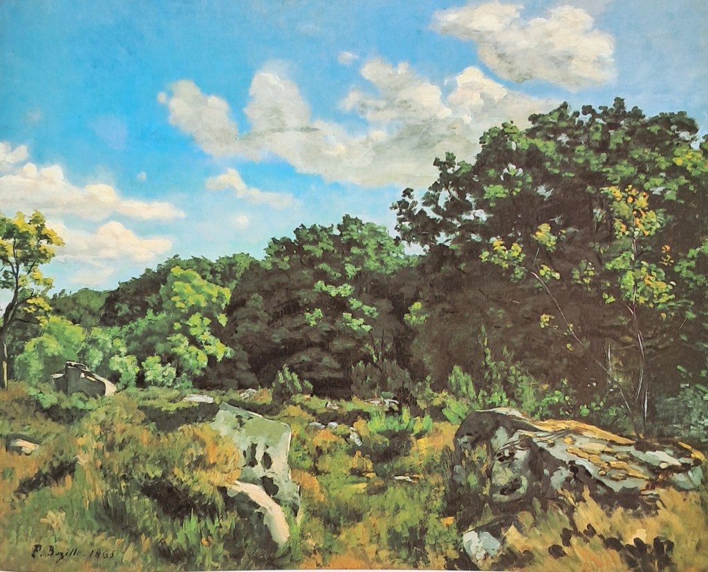
I clear away some of the pebbles and start to inhabit my painting space. As usual I have no real idea of how to proceed. The main thing is to get going, so after emptying the tea flask, I lay in some of the darker shapes. It’s always this: big shapes to smaller shapes, dark tones first, hang on to the bigger brushes as long as possible. I have no further method, and after an hour or so I’ll be involved in all sorts of unexpected improvisations, fending off disaster. The difficulty of this plein air thing is all too apparent in my clumsy first steps. I cling to the sense that I can get this right – with only a vague notion of what that looks like . Whilst painting I’m haunted by images I hold in my mind, by artists who are both daunting and inspiring. Obscurely, today I’m thinking about a Nineteenth Century French landscapist called Frederic Bazille. The landscape at Chailly (below) was done in in 1865. Monet, Sisley and Pisarro, amongst others, were all experimenting with plein air painting at that time, but the full – on Impressionist phase of broken brushwork was still to come.
As I paint, a cold front sneaks in from the South. The light is much more diffuse now. This is not necessarily a bad thing, but it’s kind of different to how it was an hour ago. That dog of mine has started wandering in ever wider circles, and so is my concentration. Time to pack it in. Maybe later on in the studio I’ll be able to work it up into something acceptable…..
When you don’t need an answer, there’ll be days like this...Van Morrison
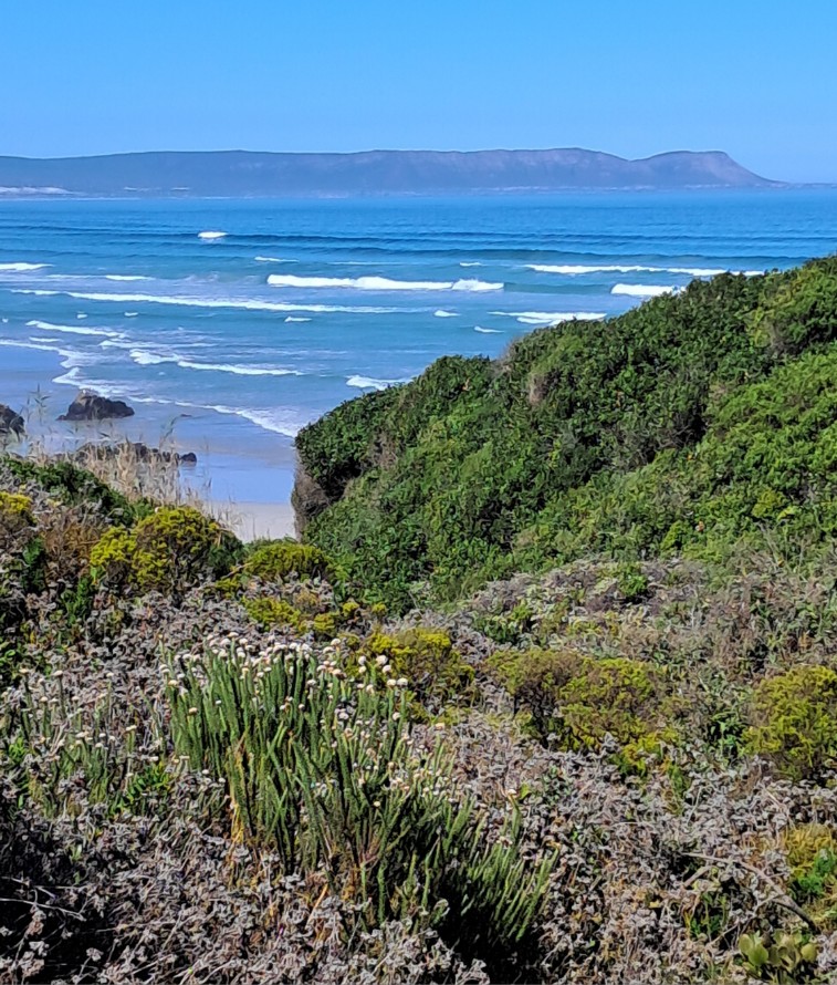
Its Easter already and summer draws to a close. All over our beloved land, people are getting the last of the sun-laden days as the light throws longer and deeper shadows. In a day or two the rain will cascade gently down, signalling the start of the dreaded Cape winter. So if you have the good fortune to live close to a beach, why wouldn’t you grab your painting gear and give it a go? Avoiding the crowds on Grotto beach, I sneak off to a secret cove nearby. I’m teaching myself to be a plein-air painter, not with much success. But if you go through the motions enough, something is bound to happen, right? I also have Project Cleo underway. That is, I’m training a six-month-old pup to be an artist’s dog. Following after Lulu, the mighty Africanis, who left us in 2023, Cleo has big shoes to fill.
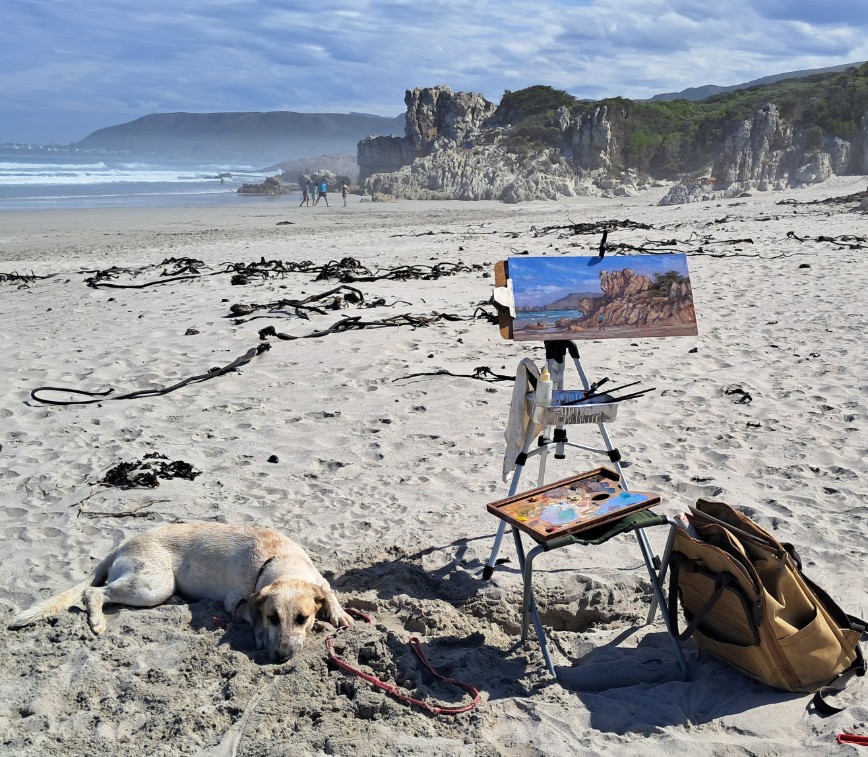
Cleo as an artist’s dog should be: restfully guarding the easel.
It only takes an hour or two of manic activity for Cleo to settle into this role. She greets and plays with everyone, but hey, she’s a teenager. Disapproving looks are often cast my way as she heads off down the beach to taunt other dogs and steal children’s playthings. While painting at the secret cove, she casually went for a walk to Voelklip with complete strangers. Then she launched herself into the surf in a failed attempt to get at some gulls sitting on the rocks. I pictured myself waist-deep in the icy waters, dragging her out. Generally though, it’s a win for both of us as she gets to have a good romp while I do a bit of distracted daubing.
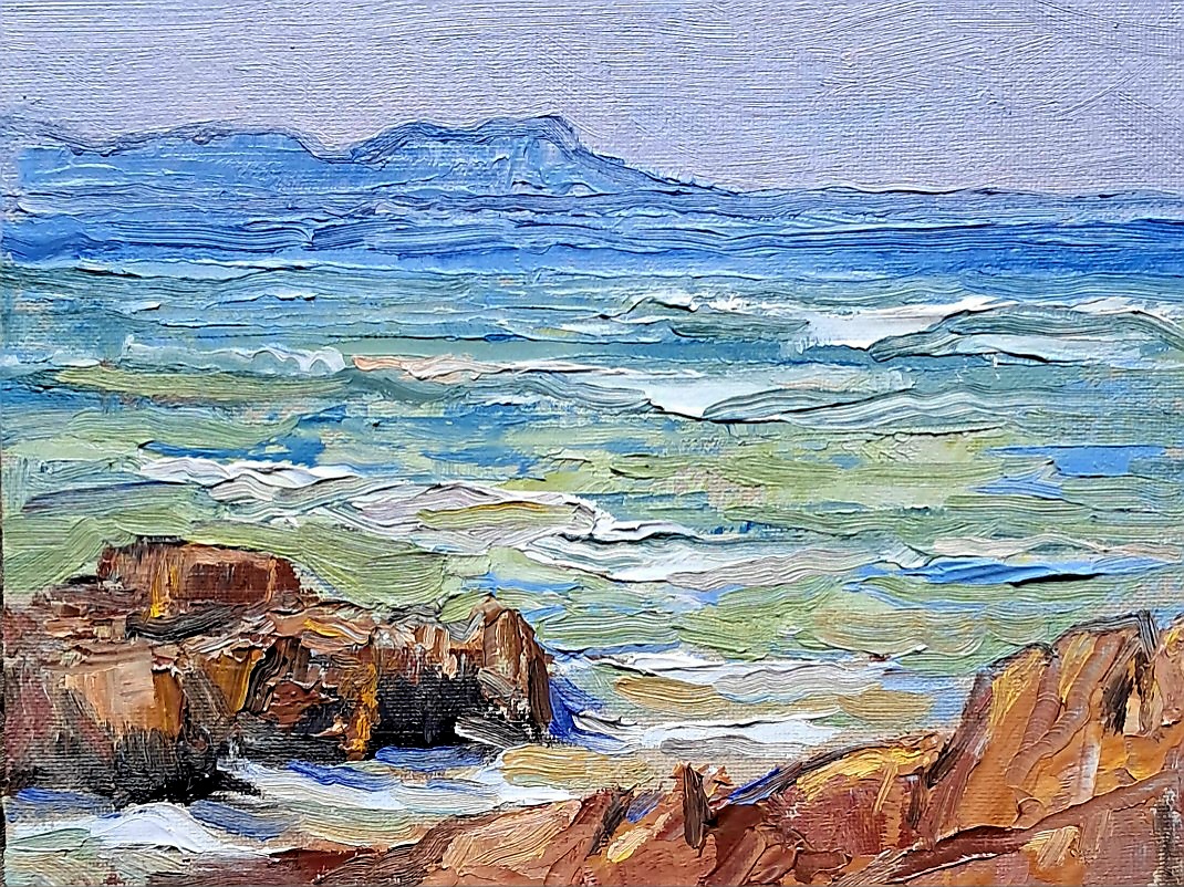
The gear I bring with me has to be as light and portable as possible : aluminium camera tripod, five tubes of paint, a small 6 x 8 inch canvas panel and a small bottle of linseed oil. All set up and ready to paint, I found that I was lighter than I wanted- I’d forgotten my brushes. There was a palette knife at the bottom of the bag, and I proceeded to lather on the paint as if I was mini Frank Auerbach. By accident I was now avoiding my usual vice of using the small brush way too early. Once back in the studio, I added a touch here and there, trying not to kill the spontaneity of the first marks. Now I have something to look at. In the life of an artist, there are very few giant leaps or great breakthroughs. It is a slow, varying, incremental journey, by no means guaranteed to succeed. Each painting poses a new set of questions. Van Morrison is onto something there – why not give up the need for an answer? Just get into the sunlight and enjoy the process. On days like this.
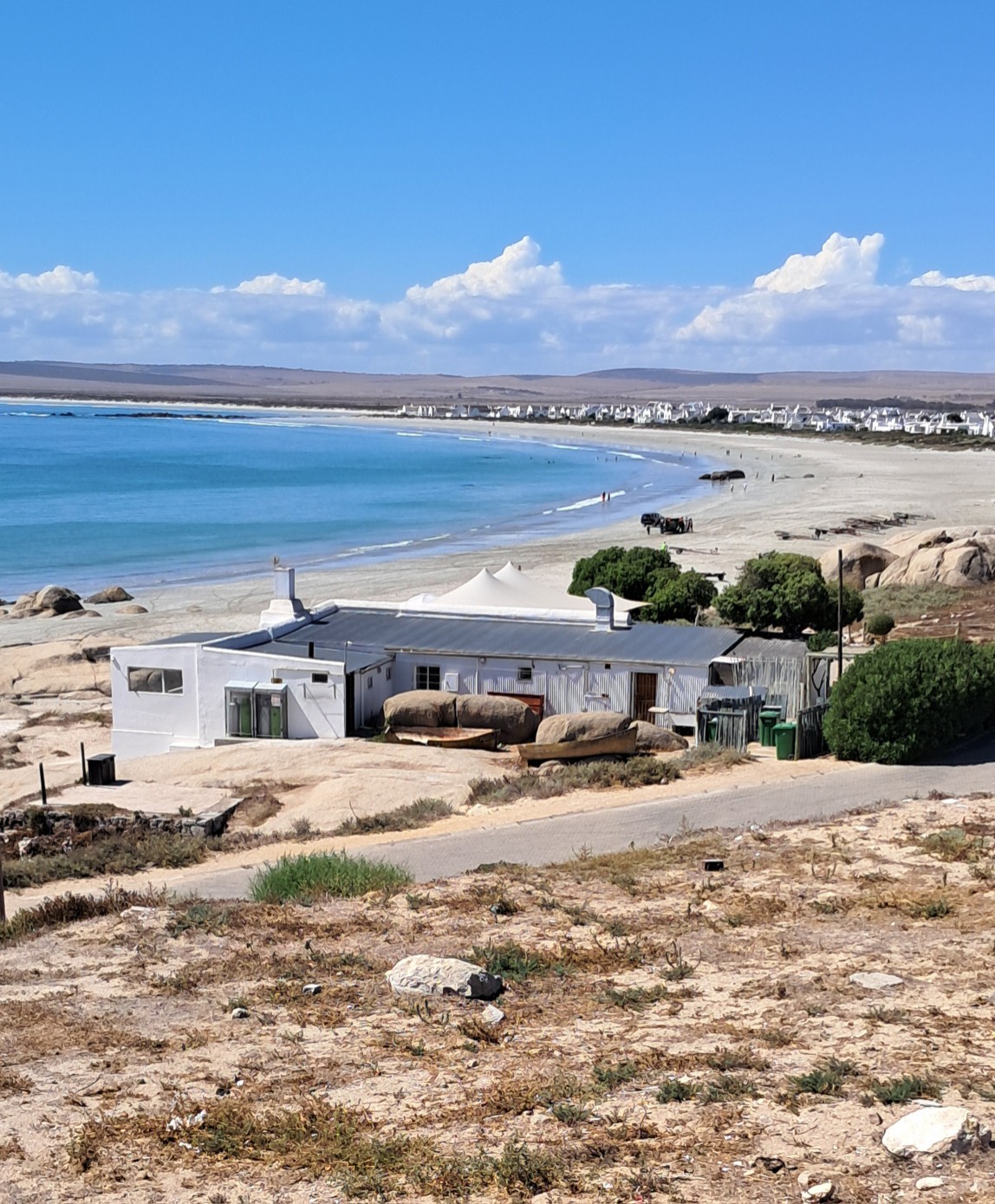
And so to the West Coast for a short break from the rigours of life in the Overberg. It’s a family outing – the good doctor and new pup Cleo are on board. The open road lies ahead! My late aunt Gisela, a staunch Capetonian, never had anything good to say about the West Coast. As we traverse the outlying industrial wastes of Cape Town and the scorched earth wheatfields towards Malmesbury, I have to agree with her. Close to the West Cape nature reserve we catch sight of some giraffe leaning into the wind near the road. They strike me as anomalous, out of place. They should surely be browsing the leaves of tall acacias, not scrubbing it among the treeless fynbos. After all, it was only much closer to the Gariep River, way to the North, that Francois le Vaillant encountered his first Cameleopard, which he promptly shot and skinned. But I digress.

Fifteen kilometers before Paternoster is the town of Vredenburg. It is surprisingly large, the coastal equivalent of say Newcastle or Rustenburg, with an extensive, abject shack settlement rolling over the parched hills. Where did all these mense come from? What the hell are they doing there? Closer to Paternoster, there are clumps of huge rounded Stonehenge – type boulders jutting out of the earth, the only thing in sight for the eye to fix upon. Pods of sheep dot the barren wheatfields, while crows circle overhead. Never a good sign that, when crows are the only birdlife.
Coming in to Paternoster, there’s no “wow” moment, no indicator that we’ve entered the idyllic realm of fishing boats- on -the -beach, as depicted by many a local artist. Having brushed off several loud crayfish salesmen of the street, (Kreef! KREEFFF!!) we find ourselves in a comfortable flatlet, surrounded by white houses in a faux-mediterranean style. They have names like “Duintjie” and “Strandloper.” There’s a strict aesthetic conformity here. Voelklip, where I live, is an architectural calamity: kak facebrick houses, grandiose concrete bunkers, this and that. I’ve always thought strict aesthetic controls would have been a good idea but now I’m not so sure: this place looks too much like, well, a theme park. With old fishing boats strewn on every other corner to give it authenticity. The wind is blowing and yes, your aging artist sees nothing to sketch and is grumpy.
Next day, we find out a bit more about Paternoster. The original inhabitants, mainly coloured fisherfolk, woke up one day to find white people offering wads of cash for their cottages. They took the cash and next thing they were on the street with large nouveau- Greek houses going up around them. Fancy eateries too. ( Kreef! KREEFF!!) But the fisherfolk smartened up and stopped selling their houses. So now, uniquely in South Africa, there’s an interesting mix of class and culture, as the rich bastards are cheek by jowl with the hardscrabble fisherfolk. Across the way from the Paternoster Hotel, (an authentic – looking place, by the way,) there’s a group of Kreef sellers. They gather every morning under the shade of the bloekombome. It is thirsty work on these hot summer days, and the manne keep quarts of beer close at hand. They joke and jest loudly, en hulle vloek mekaar lekker. I did a little sketch of that scene, thinking that a real artist would go right in there and do a series of portraits of those fellows. Francois Krige, perhaps, would have risen to the occasion.

There’s a Paternoster waterfront, better than the Cape Town one. It’s a warm day but under the shade it’s just right and, surrendering to the boats -on-the-beach cliche, I get on with a little watercolour. I’m working on 300g hot pressed paper and mixing in a bit of gouache. My painting gear is simple and portable: everything I need fits in the satchel. The sea is flat and iridescent and there are those beautiful big luminous rocks out there. The sculptor Henry Moore would have cried to see those. Everyone here is relaxed and in browsing mode, so I get several onlookers. I’m happy to interact with them and hear their stories. I meet a man from Namibia who is finding his extended family who came from the West Coast. Also a few watercolourists from England. They are polite and encouraging. I’ll take any morale – booster. After all, plein – air work is mostly destined to fail and disillusion always lurks. There is a German man too. ” Ah, malerei,” he says, surveying my handiwork. ” Ja, very good. Und such a light equipment too.” How very Teutonic, to asses the means as well as the result! Thanks my broer. We live to paint another day…..
Portjie pic
Back up to the Valley the next day, but this time I stay further back in order to get the long view. You can park here and walk up to view Spandau Kop. To the right is the Valley. You also may find paragliders launching themselves into the afternoon thermals.
")
"yee ha!"
There’s a kind of a contrast between Pierneef’s foreboding stone columns and the jauntines with which they throw themselves into the air. Pierneef’s painting demands that we regard God’s handiwork with reverence and awe. We are put in our place by the monumentality of the forms. And here we are in the 21st century, treating nature as our playground. But this has none of the intrusiveness of, say, quadbiking – there’s a graceful loop through the air. The view from up there must be awesome. I’d love to do it.
(1)")
JHPierneef. Graaff Reinet. 140x 148. oil on canvas
Walking a bit off the road and a bit closer, I seem to be in the right place. The shadows on the original painting tell us there was an afternoon light falling on those stone pillars(1)") My little watercolour also picks up on that yellowish sky. Pierneef obviously had a lot of confidence in his working drawings as well as his colour notes. Again, they seem very accurate. And he’s made a very good job of imposing order on that chaotic jumble of rocks and vegetation at the bottom of the valley. As the shadows lengthen, I suddenly notice the expanse of space to my left. It’s vast, but stitching together a number of photographs, it’s paintable. That’s my version of the Valley of Desolation
My little watercolour also picks up on that yellowish sky. Pierneef obviously had a lot of confidence in his working drawings as well as his colour notes. Again, they seem very accurate. And he’s made a very good job of imposing order on that chaotic jumble of rocks and vegetation at the bottom of the valley. As the shadows lengthen, I suddenly notice the expanse of space to my left. It’s vast, but stitching together a number of photographs, it’s paintable. That’s my version of the Valley of Desolation
(1)")
'Valley of Desolation" 30 x 100cm oil on canvas
By the mid 1700’s, European landscape painting had fixed pictorial conventions. The aspirant painter would find an appropriate setting, preferably a vista framed by tall trees in the foreground, and get to work. Art critic Robert Hughes has shown how early Australian artists struggled to adapt this scheme to their new world, creating an idealised landscape instead.
(1)")
Thomas Watling: A direct north general view of Sydney Cove (1794)
In the Cape, Table Mountain and the lush greens of the surrounding forests were certainly “expressive of that peculiar kind of beauty, which is agreeable in a picture” (W Gilpin, 1792). But as explorers moved inland, they had no aesthetic language for the endless ochre expanse of the Karoo.") (They also didn’t have a tar road stretching before them.)
(They also didn’t have a tar road stretching before them.)
Alongside these notions of the picturesque, there was also the idea of the Sublime. British philosopher Edmund Burke’s “Enquiry into the Origin of our ideas of the Sublime and Beautiful” (1757) hugely influenced C18th English aesthetic thinking. Burke tried to understand the urge to experience the untamed and awe inspiring aspects of nature, qualities that were sought by the future generation of Romantic painters and poets. According to him, “dark, confused, uncertain images have a greater power on the fancy to form the grander passions than those which are more clear and determinate.” Poor old boy, he never went to the Karoo and felt his soul expand.
")
flat as sublime
Three years ago I looked on the North side of the Swartberg Pass for the Pierneef site – nothing doing. Its definitely on the south, or Oudtshoorn, side. I take a farm road. No traffic, no cell reception, not much of a road. Probably pretty much how it was for Pierneef in the 30’s.
")
eensaamheid in die klein karoo
You take it slowly on a dirt road, and that makes you look at where you are. I’m looking at some pretty big mountains, feeling suitably insignificant. I’m sure I’ll find the site near the bottom of the pass, but I don’t. I do a watercolour and carry on up.") There’s nothing that looks vaguely like the place I’m looking for, but the Pass is stunning, something new around every corner. Quite near the top I have something to eat and do another watercolour, then head to the top. There’s a fierce wind , so I stay in the car and do a third little watercolour sketch.
There’s nothing that looks vaguely like the place I’m looking for, but the Pass is stunning, something new around every corner. Quite near the top I have something to eat and do another watercolour, then head to the top. There’s a fierce wind , so I stay in the car and do a third little watercolour sketch.
(1)")
view from 'die top'
OK. I’ve got a page of watercolours but no idea where the site is. Perhaps he made it up?
From De Rust you cross Spookdrif, Skansdrif, Damdrif, Boesmansdrif, Skelmkloofdrif, Aalwyndrif, Nooiensboomdrif and there it is, Dubbele Drif se draai:
")
jh pierneef. Meiringspoort
Following the curve of the road, this is the right place. It seems as if the river’s on the right, but if you look closely its running onto the road from the left. The river now runs under the road. And that large boulder is indeed there. Because of the new bridge, I can’t get as close as he was, so the cliffs seem less towering. The light coming in from the east tells me he was here early on a summer morning. At this time of year it only gets a touch of late afternoon light.
")
Dubbele d se draai, 2010
I’m glad that the decision about what to paint in the Poort has already been made for me, because there’s a bewildering majesty to this place and I wouldn’t know where to start. But that thing I said about the silence isn’t strictly true. There are quite a few big trucks winding through here. And some of them like to hoot at the weird oke in the hat painting next to the road, which makes me jump.(1)")
Over the mountains to De Rust tomorrow to pay my respects to famille Niebuhr. Then into nearby Meiringspoort, watercolours at the ready.
")
the C19th digicam
Don’t worry, I’ve got another block of Quinacridone Red (top right).
If I find an internet cafe in De Rust, dear Reader, I shall make a posting or two. Otherwise see you in about twelve days time….
I leave you in the good hands of this fellow traveler
(1)")
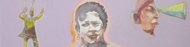
Croc man and curio. gouache on paper.
With our blogger’s computer ostensibly fixed, some pics of the recce to Stellenbosch. What I was looking for:
(1)")
Stellenbosch station panel
Driving into the town from the south the mountains were curiously shy, even absent. I ended up in the dorp itself, dodging Sunday morning churchgoers and Dylan Lewis cheetahs. Eventually I sniffed out the yellow leafed road to Jonkershoek. That’s where the mountain is:
")
the purple mountain
I kept on up the valley and at the end there were many cyclists and a nature reserve. I was too close to the mountain by now, but did this watercolour anyway. Its not very good but hell it was lekker up there in the Autumn sunlight.
")
retro - moderno - H20
Pierneef’s woodcut of the Hermanus old harbour. His graphic output – woodcuts and linocuts – was huge, and all of it of very high quality.
(1)")
old harbour, woodcut. c1931
See my post Down South (below) for a look at his painting of the same. It still looks like this – except for the boats which were washed away in a storm in 2008. And even though the camera tells us the buildings are much smaller, this is far more ‘realistic’. Perhaps it reinforces what we choose to remember? Or reassures us that we are imposing ourselves on Nature?
What emerged out of that was the recolouration I’d been hoping for (you don’t quite know what it is, but you recognise it when you see it.) I also lost some lekker paintings within paintings
")
lost Picasso sculpture
Then there was the small matter of The Sea, the dreaded sea. After numerous false starts I remembered Anton Chapman‘s advice about putting down a base of deep red. He has painted a lot of sea and knows his stuff. A layer of Venetian Red and some editing decisions later:
(1)")
Red Sea
And after quite a bit more tweaking:
(1)")
Cape Town Personae
The beast is laid to rest at last.
I don’t know what the hell happened to that last post! It’s Sunday night and I’m getting irritated, so here’s a quick look anyway at the full painting, at the point where it gets really interesting.
(1)")
the long shot
I finally figured that JHP was down by the docks – at something called Berth A. After wheedling my way past security, I felt sure this was the site: a view across the water of Lion’s Head with some industrial buildings in the foreground. Back in the studio I started rendering the panorama in a fairly loose but literal kind of way, laying in the details happily unaware that I was about to ambushed by a whole range of dubious characters….
")
Lion's Head (detail)
Two little views of the Leeu se Kop, the one in the Bo Kaap in February, sweating in the afternoon sun. The other done in March on a nondescript Saturday afternoon. Edward Hopper – a superb watercolourist – was fond of taking a watercolour from behind the frame of the windscreen.

")

Since our man often combined different views in a single image, (like the exaggerated buildings in the Hermanus panel) I figured in the Lion’s Head panel he’d done the same. So I started close to it and worked my way backwards to the water and the Postmodern malaise down by the docks….
")
Lion's Head (with a Damien Hirst dot)
")
scratching around...
Hermanus – my home town for the last two years – is the southernmost site.
Two things strike me about about this panel: He made the buildings look a lot larger than they are, and the total absence of the human figure. In those days the harbour was a hive of fishing activity. The photographic museum nearby has great pics from those days of trophy fishermen alongside their monsters from the deep. Now, sadly, you’d be hard pressed to find fish in Walker Bay. Except of course for whales. Which aren’t supposed to be fish….
")
Hermanus
Cape summer hues: Those what-colour-is-that grey greens of the Cape mountains in summer. And the ubiquitous mauve. Pierneef got those mountains in the background dead right.
For a few years now I’ve been on a mission to find and document the original sites of Pierneef’s station Panels. The paintings, done in the early 1930’s originally hung in the Joburg Station but are now housed in the Pierneef Museum in Graaf Reinet. There are 28 landscapes. Pierneef was in his early 40’s when he did them and they represent a highpoint in his career – the point where subject matter, content and style coalesce into something really strong. They secured his place as SA’s leading painter and ensured a widespread popularity.
Today we tend still to look at them and sense that they convey the essence of the landscape. By revisiting the sites, I’m trying to find out what’s left of them – how much remains after 80 years of development? Does Pierneef’s sense of those places still exist? Are they really as grand as he made them or was he a hopeless Romantic?
HOW TO DO IT?
It took me a while to figure out that I would do work that relates to the site itself and then work that relates to Pierneef’s original paintings. When I get to a site, I do watercolours and drawings as an initial response. Later in the studio I work up paintings from photographs. But there’s also a set of works that responds to Pierneef’s paintings. These usually take the form of a modified Pierneef – the original injected with some image that seems appropriate to the place.
RUSTENBURG KLOOF
The first place I went to, about 2 hours NW of Jo’burg. Easy enough to find – it’s on the map. It’s a ‘plesieroord’ with well tended lawns and bungalows. The cliff face stares right out at you and looking at Pierneef’s original painting, it was easy to figure out exactly where he was when he did the initial studies. (He did hundreds of preparatory drawings.)
This is Pierneef’s original Rustenburg Kloof Panel:

Rustenburg Kloof. Oil on Canvas. 141cmx126cm
This is my oil painting of the site:

Rustenburg Kloof. Oil on canvas, 50 x 60 cm.
And this is the modified version:

Biker 3, watercolour 17.5 x 13.5 cm

