You are currently browsing the category archive for the ‘Carl Becker artist’ category.
With our blogger’s computer ostensibly fixed, some pics of the recce to Stellenbosch. What I was looking for:
(1)")
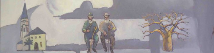
Stellenbosch station panel
Driving into the town from the south the mountains were curiously shy, even absent. I ended up in the dorp itself, dodging Sunday morning churchgoers and Dylan Lewis cheetahs. Eventually I sniffed out the yellow leafed road to Jonkershoek. That’s where the mountain is:
")
the purple mountain
I kept on up the valley and at the end there were many cyclists and a nature reserve. I was too close to the mountain by now, but did this watercolour anyway. Its not very good but hell it was lekker up there in the Autumn sunlight.
")
retro - moderno - H20
Pierneef may have chosen the old harbour site to please his patron, but by 1930, Hermanus was already a famous fishing paradise. This was largely due to the exploits of one Bill Selkirk, who, after a five and half hour battle from the rocks at Gearing’s Point, landed a 987kg shark:
")
Selkirk and shark
The London Illustrated News devoted a double page spread to this in 1928. The De Wets Huis Photo Museum has many other pics of fishermen and their “trophies”. But by today’s standards these examples of manly virtue may look like accomplices to a crime: We no longer subscribe to the idea of killing animals as “sport.” And there are hardly any fish to be had.

Giant Ray
Giant Ray and Boy . Watercolour 22 x 17cm .2009
Not Valentines day, but Nineteenth Century Romanticism. The Romantic painters responded to the industrial age by looking for the sublime in Nature, a quest that was both aesthetic and spiritual. And even well into the C19th, when the Impressionists were drenching themselves in sunlight, the gloomy Northern Romantic tradition continued. (It’s been argued that Pierneef belongs to this current in European painting.)
I chose to show the harbour buildings overwhelmed by the magnitude of an Atlantic storm: A very Romantic idea.
")
Old Harbour, Hermanus.
Oil on canvas.60cm x 170cm.2009
What emerged out of that was the recolouration I’d been hoping for (you don’t quite know what it is, but you recognise it when you see it.) I also lost some lekker paintings within paintings
")
lost Picasso sculpture
Then there was the small matter of The Sea, the dreaded sea. After numerous false starts I remembered Anton Chapman‘s advice about putting down a base of deep red. He has painted a lot of sea and knows his stuff. A layer of Venetian Red and some editing decisions later:
(1)")
Red Sea
And after quite a bit more tweaking:
(1)")
Cape Town Personae
The beast is laid to rest at last.
OK hopefully now these okes will not disappear into hyperspace when I press the ‘Post’ button …
")
really a nice bloke at heart
")
me too
I liked these guys
and now they at least
have a virtual
if not a paint life!
Painterly discontent. Unhappiness with the colouration as well as an inability to resolve the compositional challenges leads our humble painter over the edge!
")
I don’t know what the hell happened to that last post! It’s Sunday night and I’m getting irritated, so here’s a quick look anyway at the full painting, at the point where it gets really interesting.
(1)")
the long shot
Well here they are – and some got away from the painting and now only have a virtual life!
")
aging groover quits town 2 This is what's known as becoming a victim of your imagination. Suddenly the painting could go in any direction (as well as downhill): the long shot.
I finally figured that JHP was down by the docks – at something called Berth A. After wheedling my way past security, I felt sure this was the site: a view across the water of Lion’s Head with some industrial buildings in the foreground. Back in the studio I started rendering the panorama in a fairly loose but literal kind of way, laying in the details happily unaware that I was about to ambushed by a whole range of dubious characters….
")
Lion's Head (detail)
Dear Reader! Since our readership has dwindled! we’ve decided! to make this blog! a bit more like the Daily Sun!
")
or is it a self portrait gnashing teeth ?
Two little views of the Leeu se Kop, the one in the Bo Kaap in February, sweating in the afternoon sun. The other done in March on a nondescript Saturday afternoon. Edward Hopper – a superb watercolourist – was fond of taking a watercolour from behind the frame of the windscreen.

")

Since our man often combined different views in a single image, (like the exaggerated buildings in the Hermanus panel) I figured in the Lion’s Head panel he’d done the same. So I started close to it and worked my way backwards to the water and the Postmodern malaise down by the docks….
")
Lion's Head (with a Damien Hirst dot)
")
scratching around...
For a few years now I’ve been on a mission to find and document the original sites of Pierneef’s station Panels. The paintings, done in the early 1930’s originally hung in the Joburg Station but are now housed in the Pierneef Museum in Graaf Reinet. There are 28 landscapes. Pierneef was in his early 40’s when he did them and they represent a highpoint in his career – the point where subject matter, content and style coalesce into something really strong. They secured his place as SA’s leading painter and ensured a widespread popularity.
Today we tend still to look at them and sense that they convey the essence of the landscape. By revisiting the sites, I’m trying to find out what’s left of them – how much remains after 80 years of development? Does Pierneef’s sense of those places still exist? Are they really as grand as he made them or was he a hopeless Romantic?
HOW TO DO IT?
It took me a while to figure out that I would do work that relates to the site itself and then work that relates to Pierneef’s original paintings. When I get to a site, I do watercolours and drawings as an initial response. Later in the studio I work up paintings from photographs. But there’s also a set of works that responds to Pierneef’s paintings. These usually take the form of a modified Pierneef – the original injected with some image that seems appropriate to the place.
RUSTENBURG KLOOF
The first place I went to, about 2 hours NW of Jo’burg. Easy enough to find – it’s on the map. It’s a ‘plesieroord’ with well tended lawns and bungalows. The cliff face stares right out at you and looking at Pierneef’s original painting, it was easy to figure out exactly where he was when he did the initial studies. (He did hundreds of preparatory drawings.)
This is Pierneef’s original Rustenburg Kloof Panel:

Rustenburg Kloof. Oil on Canvas. 141cmx126cm
This is my oil painting of the site:

Rustenburg Kloof. Oil on canvas, 50 x 60 cm.
And this is the modified version:

Biker 3, watercolour 17.5 x 13.5 cm

