You are currently browsing the category archive for the ‘Art history’ category.
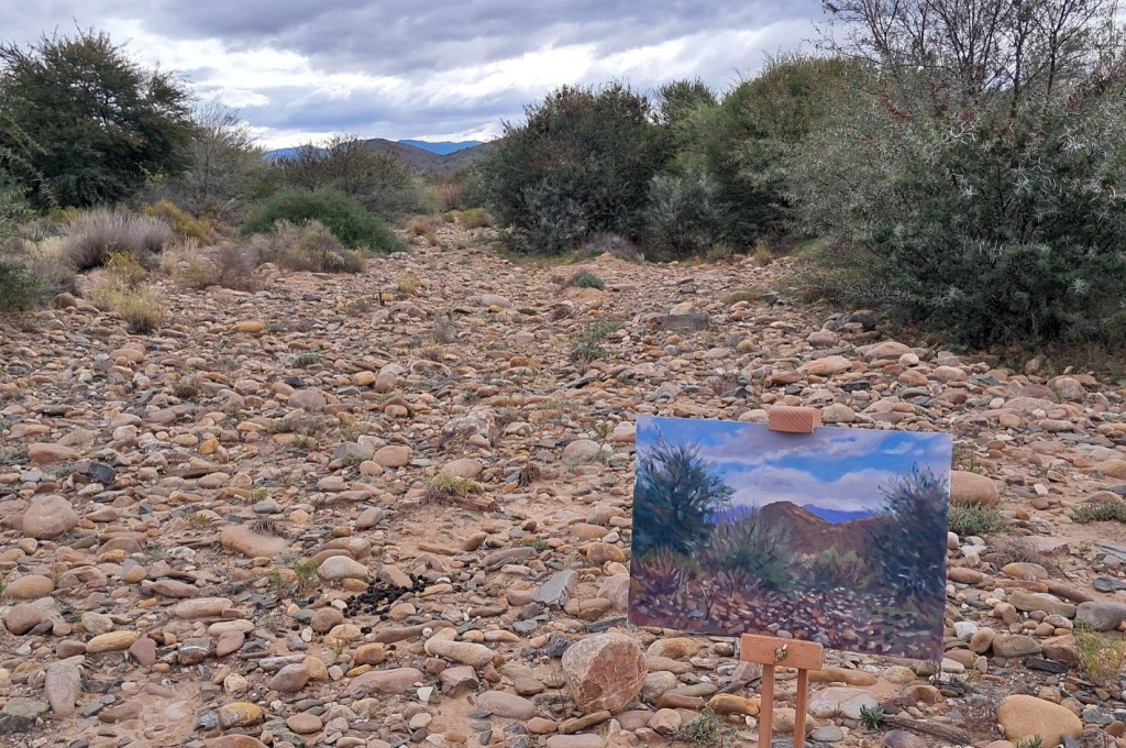
Winter in the Klein Karoo. I am walking through open country, towards the Touws Rivier. The beechwood easel is slung over my shoulder and little Cleo is trotting up front. I’m heading for a small cliff that I may like to paint. It feels right, moving through the stones and scrub, with the odd cloud scudding overhead. It takes a while to settle on something – I am spoilt for choice and can’t decide. There’s no water in the river, and the riverbed is what I settle on. The view up the riverbed, with the stones and the dark shadow under that acacia tree is what catches my eye.
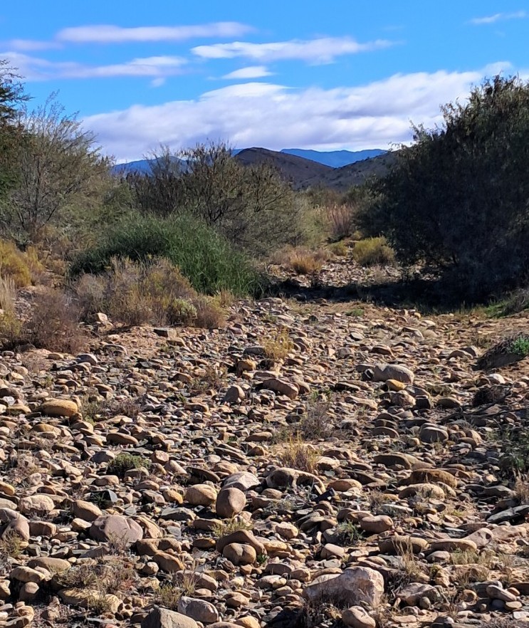
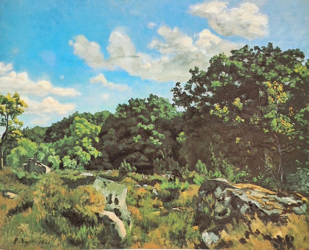
I clear away some of the pebbles and start to inhabit my painting space. As usual I have no real idea of how to proceed. The main thing is to get going, so after emptying the tea flask, I lay in some of the darker shapes. It’s always this: big shapes to smaller shapes, dark tones first, hang on to the bigger brushes as long as possible. I have no further method, and after an hour or so I’ll be involved in all sorts of unexpected improvisations, fending off disaster. The difficulty of this plein air thing is all too apparent in my clumsy first steps. I cling to the sense that I can get this right – with only a vague notion of what that looks like . Whilst painting I’m haunted by images I hold in my mind, by artists who are both daunting and inspiring. Obscurely, today I’m thinking about a Nineteenth Century French landscapist called Frederic Bazille. The landscape at Chailly (below) was done in in 1865. Monet, Sisley and Pisarro, amongst others, were all experimenting with plein air painting at that time, but the full – on Impressionist phase of broken brushwork was still to come.
As I paint, a cold front sneaks in from the South. The light is much more diffuse now. This is not necessarily a bad thing, but it’s kind of different to how it was an hour ago. That dog of mine has started wandering in ever wider circles, and so is my concentration. Time to pack it in. Maybe later on in the studio I’ll be able to work it up into something acceptable…..
And so, Northwards, to Namibia! First though, to the Caledon Home Affairs office, to collect my new passport. There was one stamp in my old passport, an entrance to Lesotho at the Maputsoe bridge. That was my first crossing into a foreign country in search of Pierneef, many Octobers ago. So, indulge me dear reader while I tell you about this little excursion.
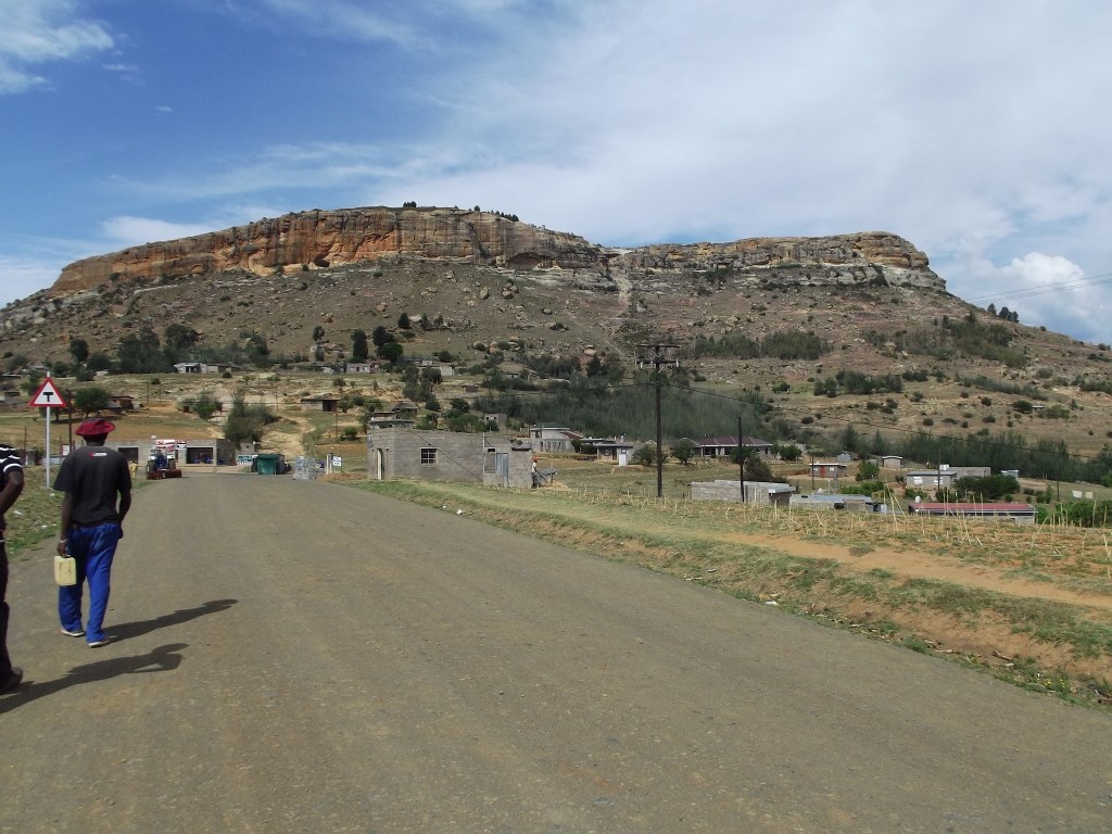
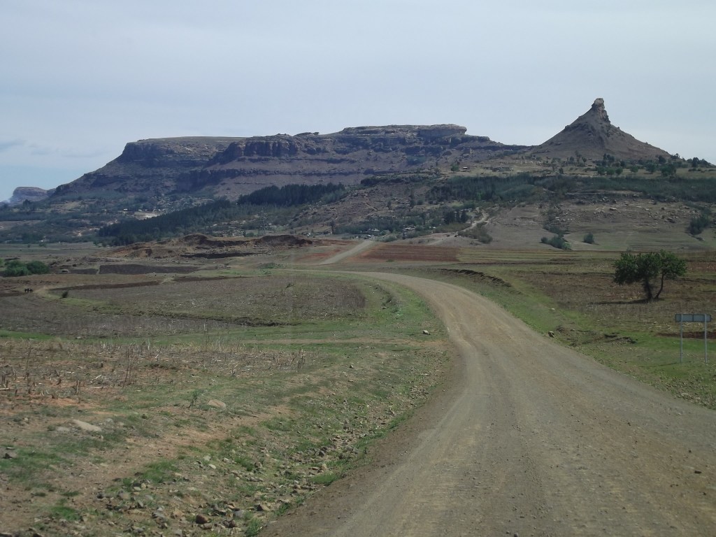
The Lesotho site has proved the most elusive of all the 28. There’ve been many “direct hits” and many other places where we sense we’re in the general ballpark. But Lesotho? I’ve driven all the way around the Western flank, more than once. Clearly, Pierneef gazed at the Maloti mountains from somewhere in the Eastern Free State. I bet on Ficksburg because Pierneef had spent some time there in 1922, doing mural paintings at the Hoerskool. I found a helpful bloke in the Ficksburg tourism office, and after much consideration, he decided this view was actually inside Lesotho. He took out a map and marked the route there for me: along the R25 towards Katse Dam, just past the village of Pitseng. That’s where I’d find it. So now the search had become transnational. On the other side of the border I bought a stout walking stick, beautifully beaded at one end. Good for klapping your enemies or to lean on when ascending the mountain slopes.
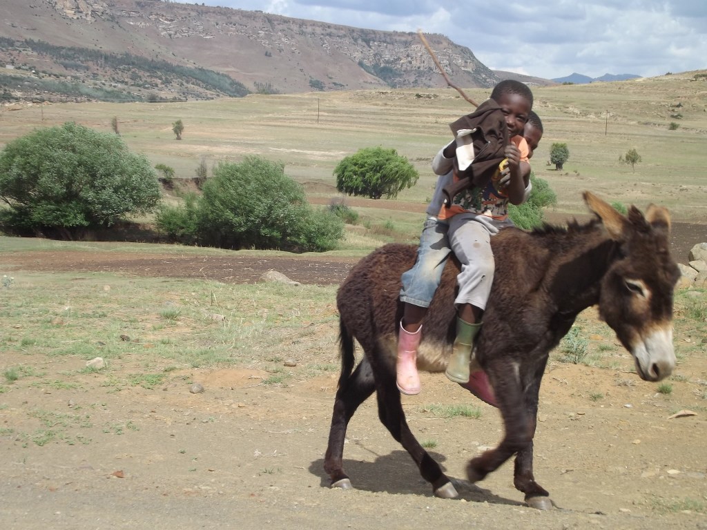
I drove windingly past scattered settlements, nestled against the slopes in a pleasing way. There’s a happy confluence of traditional and more modern-looking houses. Cars, livestock, poultry, and pedestrians all share the roadside and the whole thing seems to tick over at a leisurely egalitarian pace.
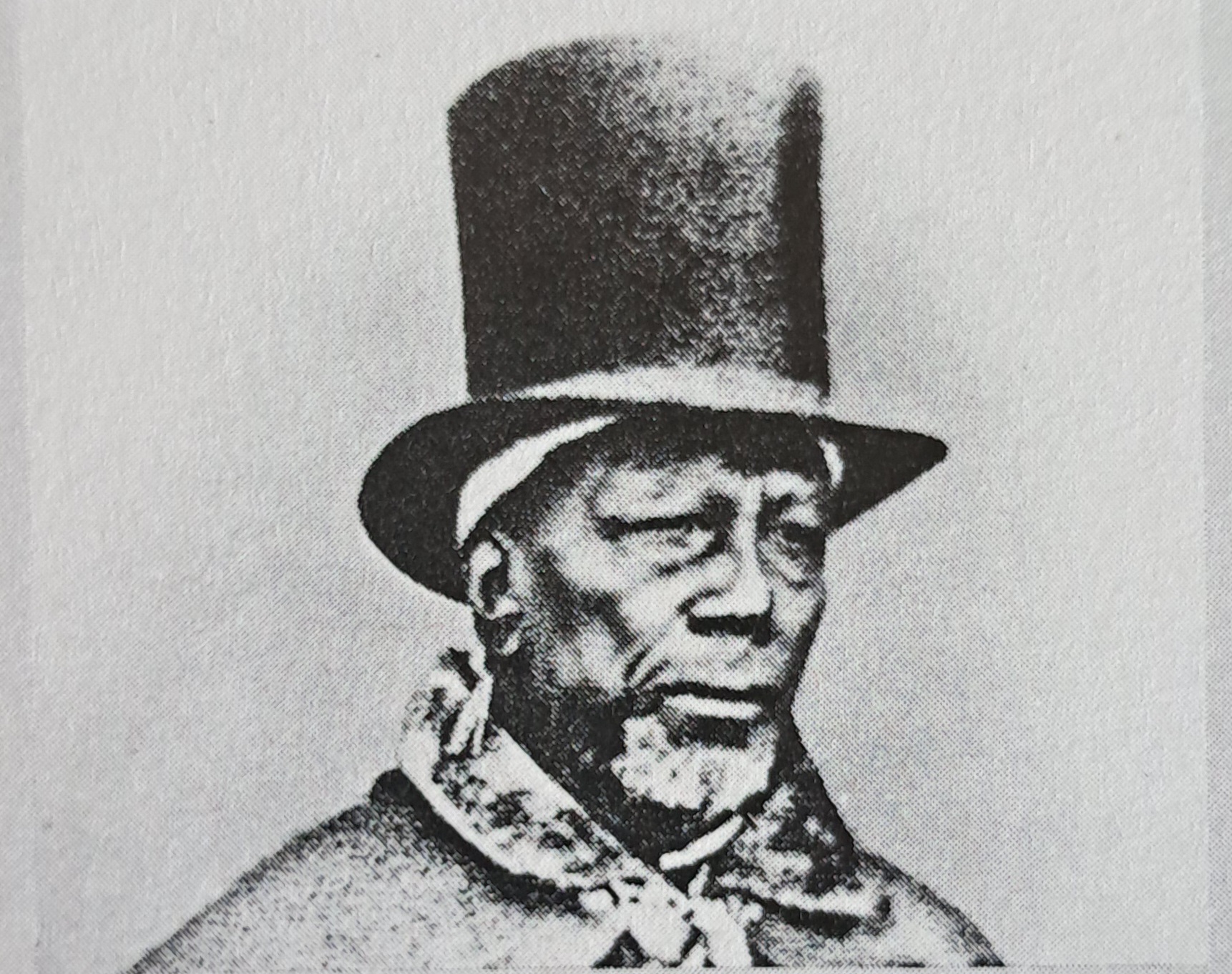
I went into a small supermarket and the teller, delighted to have a tourist, pointed out the grand figure of “our Father, Moshesh” on the banknotes. In the mid 1800s, Mosheshwe took a bunch of desperate, dissolute refugees and shaped them into the Basotho nation, while fighting off the likes of the Mantatees and the Boers from his mountain stronghold of Thaba Bosiu. He was one of the greatest Southern Africans.
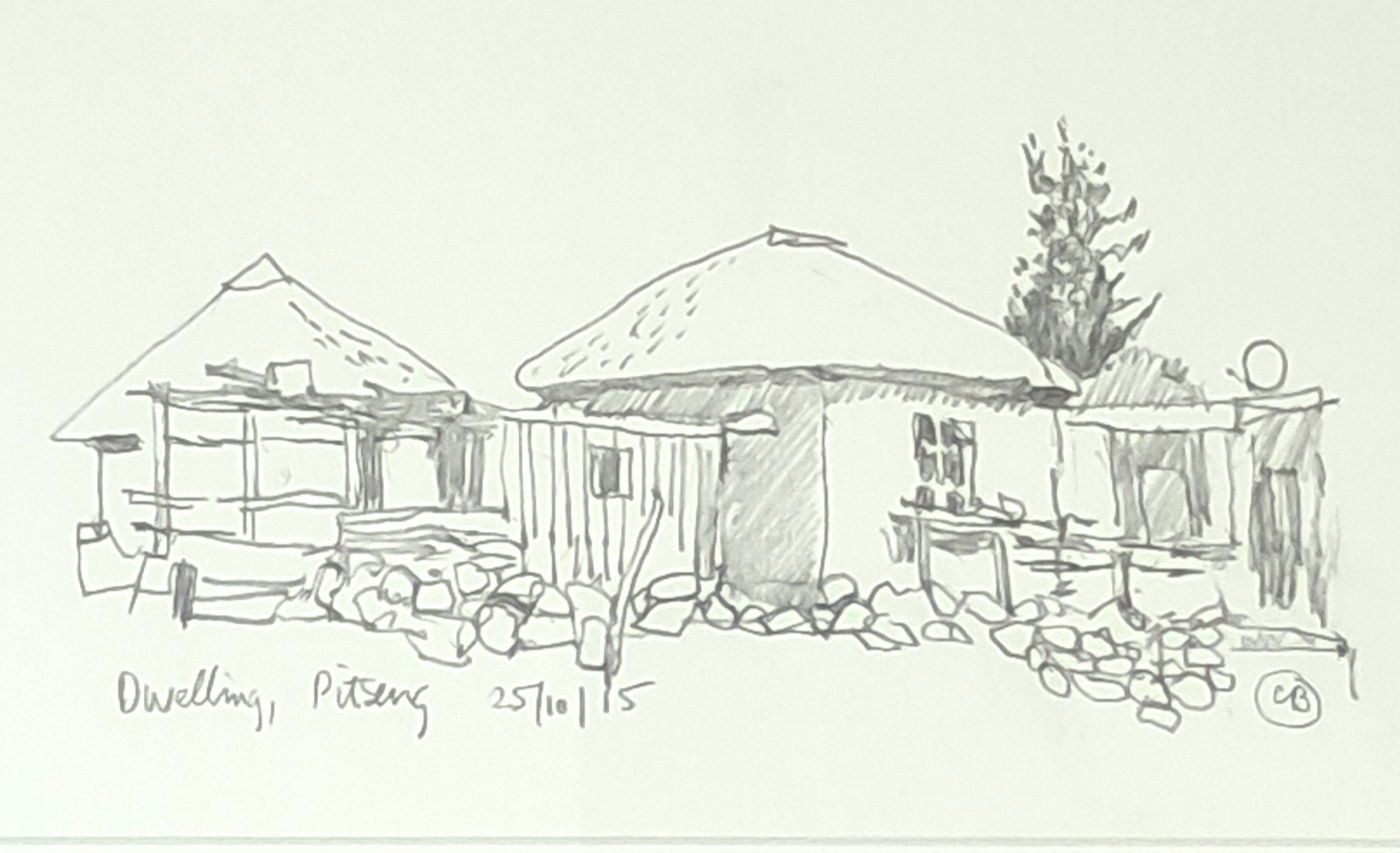
I got to the village of Pitseng. Nothing remotely looking like Pierneef’s painting. I went on further towards the Katse dam, getting into the high country. It wasn’t right – I was supposed to be looking at the mountains from afar. I did a sketch and turned back, stopping for a quick little drawing of houses.
Unable to resist a dirt road, I took a detour. There wasn’t that much of the day left, and I knew that I wasn’t going to find the site.
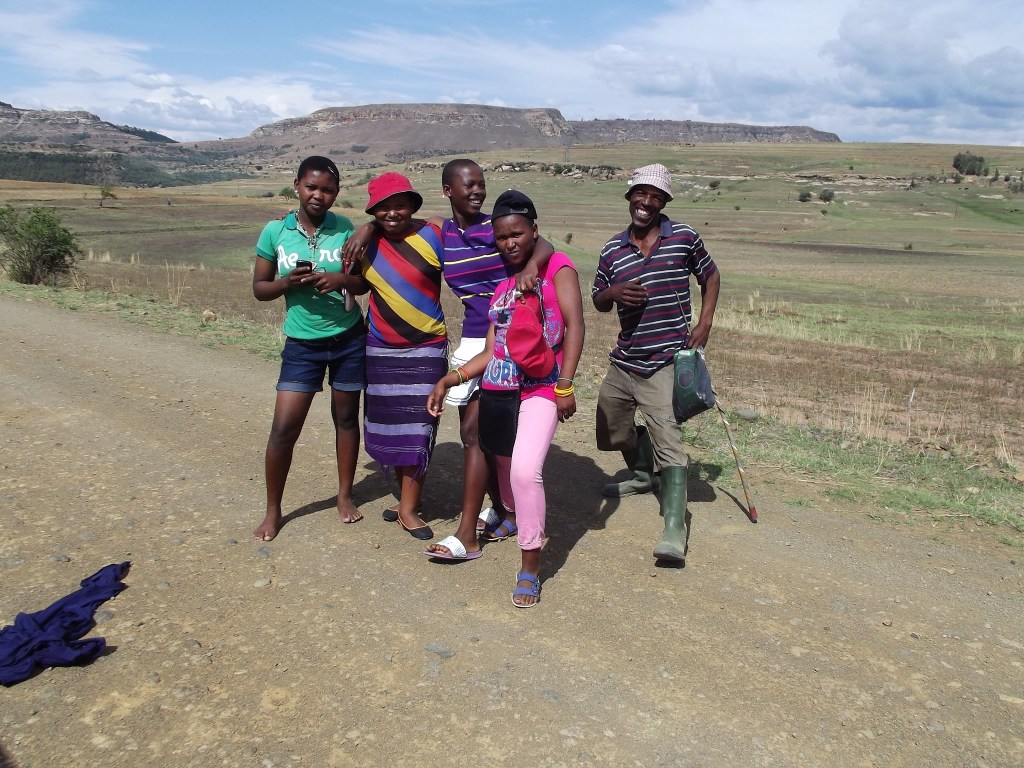
On the barren road I met the children of Moshesh, brightly dressed against the khaki landscape. They were happy to strike a pose.
Later, getting back on the main road, I met a man carrying a small white wooden suitcase. He said, ” Are you perhaps interested in some of Lesotho’s finest?” Stupidly I thought he was referring to the hand -crafted suitcase, but when I looked inside, it was full of well-packaged dagga. A traveling salesman! I politely declined, but perhaps I few drags on the dagga cigarette would have helped put me in touch with the ancestors, who could have guided me to the Pierneef site? Ja Nee….
“…her country, our country, but also nobody’s country, a myth of country in a constantly changing continuum of life and light that exceeds all countries.” – Alex Dodd
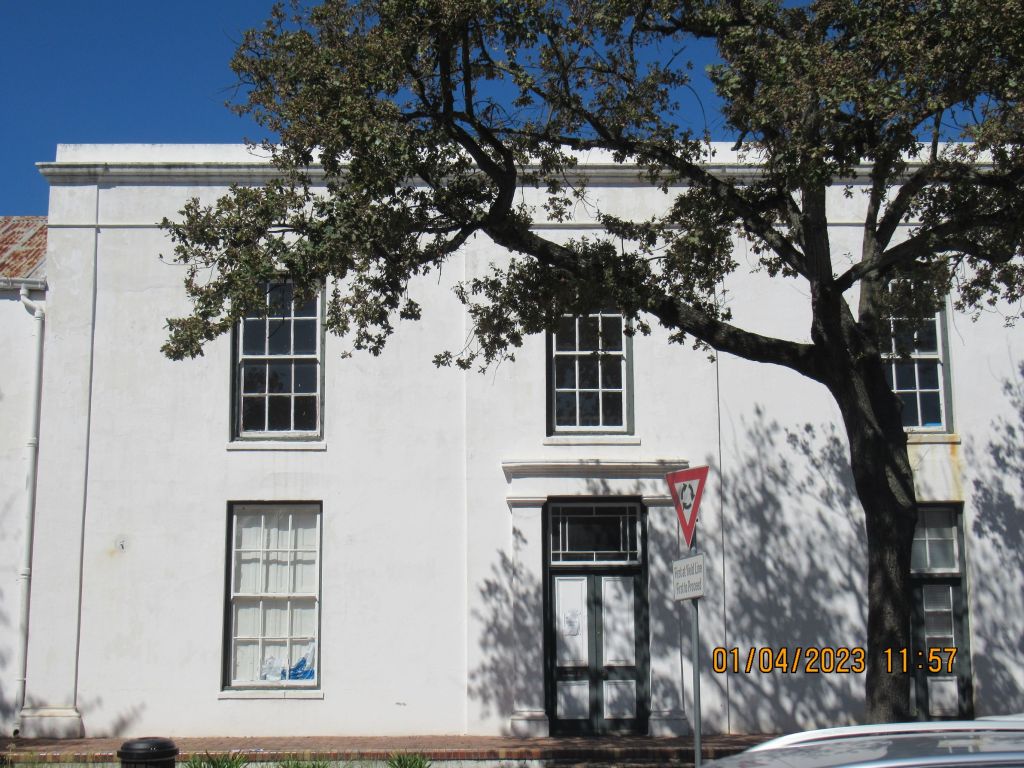
On a sunny Saturday morning I ventured over Sir Lowry’s pass and through the wasteland of Somerset West to Stellenbosch. Destination: The Ilse Schermers gallery in Dorp Street, somewhere behind that mountain there.
Ah, the Cape: Big mountains, expansive views over the Atlantic, and… expansive, drab, treeless, dismal – looking squatter camps. Are there squatter camps around Istanbul, I wonder? I think of that ancient metropolis because the artist Diana Page lives there, and her poetically – titled show, ‘Walking on a rim of light,” was about to open.
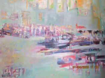
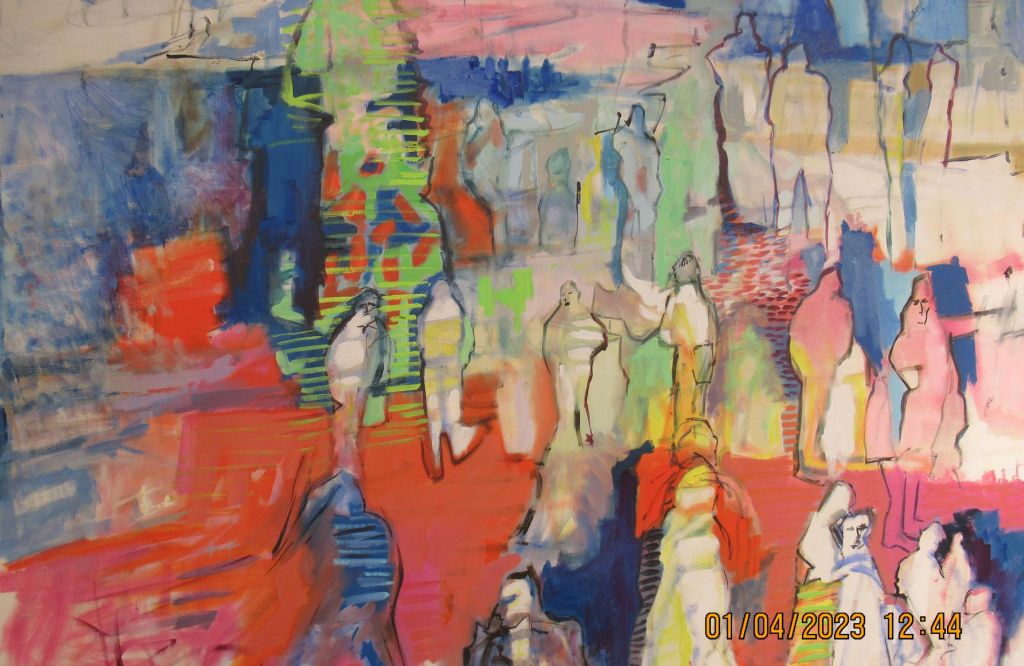
Page has lived in the evocative city of light for the past 16 years, and the work is a selection from the past six or seven years. Stellenbosch feels Mediterranean today, and the work seems right at home here. A travelling show is a logistical nightmare – all those big heavy crates, expensive and difficult to move. Not to mention customs and god knows what other obstacles. Undaunted, Page found a guy to roll the canvases – and shipped them to her first port of call, the excellent Oliewenhuis museum in Bloemfontein. And now they’re in Stellies.
You’d call this work abstract, no doubt about it, but actually we’re led in and out of a field where form coalesces and then dissipates again. There are glimpses of stuff we know: here, figures and buildings, there a cobbled lane, a face in a crowd. We’re aware of the calligraphy of the brush, its agitated or doubtful scratchings that lead us into gentle swathes of colour. It’s not about the topography or the specifics of place. It’s more to do with the global stuff, like light and its emotive effects. I had a little thought that yes, art – particularly abstract art – really is an international language.
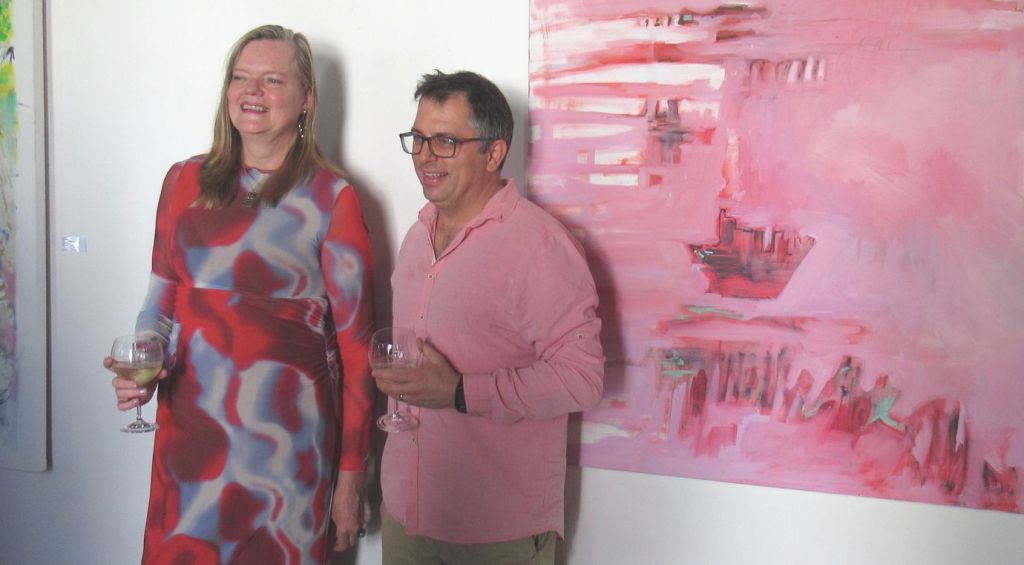
Not content with one speaker to open the show, Page brought in two, both of them Phds. Outrageous! Talking about art is hard at the best of times, but Alex Dodd and Julia Martin did the business. They brought the gravitas with not a whiff of pretension.
Funny things, exhibition openings. Well – heeled folk mixing with bohemians, art – lovers, networking artists and some who’re really just there for the wine. I met some new people and caught up with some I hadn’t seen for a while. And then it was enough and I walked out into the bright mid -day sun. There is the smell of money in Stellenbosch these days. The streets are littered with Porsche Cayennes and Dylan Lewis sculptures. Pavement cafes abound, where the young and suntanned take their sparkling drinks. But the old Cape persists through these changes, a message from another, distant, country.
The show comes down on April 30, go have a look if you can.
We get hold of a tube of oil paint, squeeze it out, add a bit of turpentine to thin it out, and off we go, not thinking too much about what’s actually in that tube. You need two things to make paint: a finely ground coloured powder called pigment, and something to bind your pigment so that it sticks to your chosen surface and stays there. Over the centuries, artists tried a lot of gooey stuff and for a long time, egg yolk -called Tempera painting – was a popular binder.
But tempera is difficult to blend. It dries very quickly and in order to create volume, you have to put down shading in a lot of small strokes – kind of like cross hatching. You can’t gently blend tones from light to dark. Then in the early 1400s, some chaps in the Low Countries, mainly Jan Van Eyck , discovered that if you mixed oil into your paint it was a lot more flexible and luminous and there was a big leap:


They experimented with a variety of oils – but in the end, linseed oil was the business. It is flexible, durable and importantly for us starving artist -types, affordable. You can get boiled and raw linseed oil at your hardware store, and the refined, pricier version for painting at the art shop. My love for the stuff started when I was a teen, curing my first cricket bat – it took many coatings of oil. The oil had a lovely aroma and made me think about walking onto the pitch, calmly surveying the enemy field, and then smacking a perfect cover drive like my hero Graeme Pollock.

Eventually my bat was ready for action and I found myself in a real cricket match. I was somewhere in the middle order and our openers in the Jeppe under 13 b team had not fared well. My turn came, sooner than I thought it would. I fumblingly strapped on the leg pads and headed to the middle. The bowler gave me the evil eye and then walked back to his mark. And then he walked even further back. Crikey! He came charging in from miles out . I closed my eyes and put the bat in front of me. The ball glanced off the bat and shot away, all the way to boundary. Four runs! Alas, that was my finest moment. Three deliveries later I got bowled out. Not long afterwards, I was dropped from the team and frankly I didn’t mind. Now I had more time to work on my poster of Percy Sledge.
The only drawback to linseed oil is the same thing that made it popular in the first place – it dries slowly. Artists have tried a lot of ways of speeding up the drying, not all good. The answer for me was hidden in the covers of this book, published in 1949:

There, on page 105, is the secret: sun- thickened linseed oil.
You lay out your oil in a flat dish, about half a centimetre deep, and you cover it with a glass lid. It musn’t be sealed – you leave a small gap for air flow between dish and lid. You have to be careful that dust and stuff doesn’t get into the oil, and this is difficult when you’re leaving it in the sun for a week or more. No matter what you do, stuff finds its way in. You keep your eye on it and jostle it around a bit to prevent a film forming over the top. Once the oil has reached the consistency of honey and has several bugs in it, you’re ready to go.

According to Doerner, “it dries with a certain gloss, and has been used for centuries as an excellent painting medium, by Rubens among others. It gives the colours an enamel- like character and permits, despite its viscidity, a great amount of technical freedom. Cennini (b1370 ) called it the best of oils.”
Linseed is also called flaxseed, and when cold- pressed (and definitely not left out in the sun,) you can add it to your diet. Yes people, its very good for you. Mahatma Gandhi knew that too, “whenever flaxseed becomes a regular item among the people, there will be better health,” he said.
And one last thing. Linoleum. You remember the dark brown linoleum we use to make linocuts? The main component of that sweet- smelling stuff is linseed and linseed oil too. Where would we be without the humble linseed?

The oke from Auckland has been doing a residency out at the Wildgarten studio for the last month or so. He got off the plane with a suitcase filled mainly with oil paint. Then he drove out to Wildgarten in the maroon 1996 Jetta and set up shop. Its been two years since his last visit and he’s busy putting out new work to sustain his ties to the Borman Gallery in Cape Town.
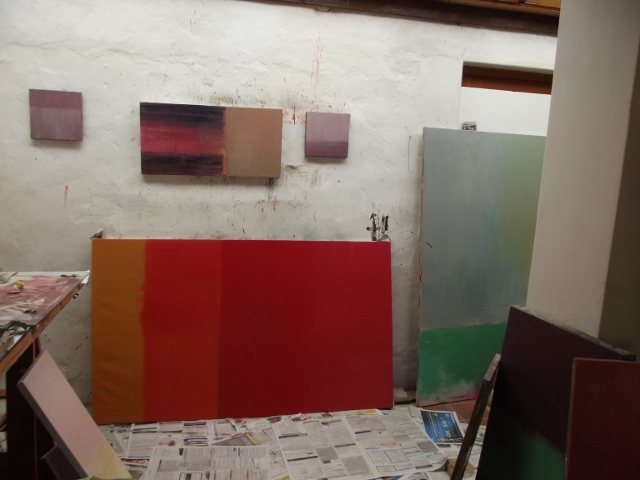
I visited Chapman at the studio a few days later. He was waiting for fresh canvases to arrive, but had launched fearlessly into a number of old ones. These have been standing against the wall waiting for another turn. They already have a certain character and history as objects. The roll of 1970’s Belgian linen purchased in Auckland, worked on in De Rust in 2012,and abandoned. That tricky bit of buckling canvas that won’t get straightened out. The edges, streaked with small accretions of paint that give us clues, like the rings of a tree. The work looked promising after the opening salvos. However, one knows that Chapman’s process is no straight road. He’ll take the canvas in all sorts of directions before settling on something he trusts. There’ll be any number of re-workings, the paint coming off and going on in successive bouts of arrival and subversion.
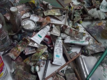
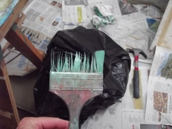
Chapman knows a lot more than most about the behaviour of pigments, their drying times, their opacity or transparency, how they brush out, and so.(The American manufacturer Williamsburg is a favourite.) He’s particular about brushes, too, sometimes re -engineering them for specific tasks. The favourite ones are cherished and used until long after their sell-by date. I came across this trusty old steed in its dying throes:
One could argue that the square-type paintings that have occupied Chapman for the past few years are a vehicle for journeys into pigment and colour that are unhindered by the need to make representations of things. We refer to them as “abstract”, but what does that mean? It still implies an abstraction of things, whereas “non representational” seems a better label, if you must. Personally, I don’t need to hang words onto these works. A look around the studio tells you that this is an artist who is very in love with paint and what it can do. (He will enthuse about the butteriness of Flake White, the need for a true Cerulean Blue, or the transparency of Williamsburg’s Ardois Grey.)
Colour in the new paintings is restrained. They don’t shout at you. They draw you in in a matter-of-fact kind of way. So, is there more to this than meets the eye? Well, yes. There’s the life of the painter to consider, the sense of craft, the sense of a lineage. In some esoteric way these all flit in and out of a painter’s consciousness and onto the canvas. Of the many painters we’ve talked about over the last few weeks, Chapman holds a special regard for the sage of Italian still life, Giorgio Morandi. Among the living, he likes Peter Doig and the New York abstract painter Amy Sillman. The work of those artists might help to map out points of reference for these paintings. But so might the taste of a good Chenin Blanc after a hard day’s slog. Or a long leisurely stroll through the mountains with an Africanis by your side.
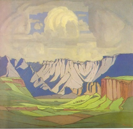
And so to the three Pierneef KZN sites. A quick online search reveals that Pierneef’s panel simply titled “Drakensberg” is the Sentinel, that jutting lump of basalt to the right of the Amphitheatre. The second mountain painting is Mont aux Sources. The way to get to these is through Tendele camp, in the Royal Natal National Park. A world heritage site and a little piece of heaven if ever there was one. Nice one, Henk. On your trail I’ve been down some crooked paths, spent strange nights in bad taste game lodges, trawled the nether regions of no – hope Noupoort and been kicked off disused mining property in Joburg. I’ve met fierce frontiersmen in Louis Trichardt and I’ve sat pondering the elegance of your handwriting in the National Archives. I’ve seen your serene landscapes rudely interrupted by four lane highways, hooting trucks, Tuscan townhouses and the rolling carnival of modernity that is South Africa today. Sometimes the trail runs cold. Others, its like going through a wormhole, back into a lost world.
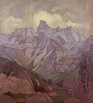
JH Pierneef
Drakensberg 127x 140 cm
c1931
Pierneef’s Drakensberg is indeed a place of dragons, brooding and mysterious. Making tea on a bright morning I looked around and seated on the breakfast table behind me was a large chacma baboon. I ordered him out and he left the bungalow clutching some canderel sachets and a lemon, looking hurt. Then he sat on the patio table and looked through the window at me eating my breakfast. I threw a jug of water at him. He gave me a very sour look.
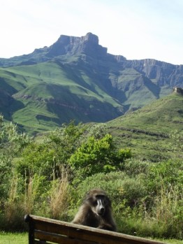
Wat kyk JY?
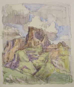
Later that day, the mood changed and heavy Pierneefian cloud settled around the mountains. It stayed like that for several days. I slept, I read, I made drawings of trees and starlings. No clear view of the enshrouded peaks. Happily, I prolonged my stay. As many an Alpine wanderer has noted, the mountains have the effect of expanding the soul. Rich fragrances float on the breeze. Notes on a drawing list these as ” honey… turkey shed in Pretoria….grandfather’s Tabac.” The high air gets into obscure crevices of memory it seems. When the sky opened up I drew and did quick watercolours. The foothills have a lot of grey and red in them, and the deep langorous shadows suggest Ultramarine. Nature is big here and very changeable, a visual feast of monumental forms. And never enough time to get it all down.
 .
.
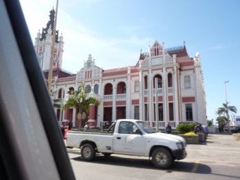
City Hall en passant
And so with Pierneef to the Eastern Cape, to the mysterious world of East London. I tell people I’m having a show there and they softly mouth the words “East London” in an “ag shame” way, and the conversation ends. They don’t know what to say: I might as well be showing in outer space. How desperate, to be scrabbling about where nothing ever happens! True, East London does feel like a town past its glory days. The lovely colonial and deco buildings of Oxford street have taken a knock, but it’s the transforming – the sense of the frontier – that makes the Buffalo City so interesting.

The gallery was built in 1905 , and bought in 1907 by the prosperous Bryant family. The colonial English went forth and made replicas of their world. They named their suburbs and streets Berea, St Andrews and St Marks, and they came to stay with all the confidence of a conquering race. In this mini London, the well-to-do copied and even outdid the standards of the metropolis. From the ceilings to the parquet floors and art nouveau door handles, no expense was spared. The far – sighted matriarch bequethed it all to the city and, after recent restoration, the house looks grand again. In the garden, the coach house doubles as coffee shop and extra gallery, and between venues they have up to twenty shows a year.
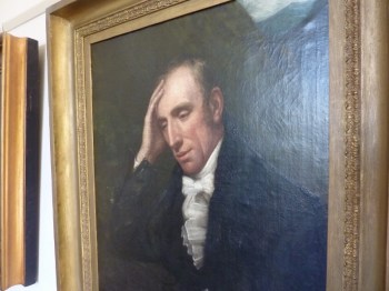
There’s a rare portrait of Wordsworth here, much coveted by the Wordsworth Trust. Here’s the wandering poet of the lonely cloud, looking somewhat homesick.
With the exhibition formalities done, I took to sightseeing with my old china Mr Donnelly. Down at the beachfront we met some Zimbabwean craftsfolk. Sales, they told me, were fair to middling. They too were a long way from home. We took the road down the coast, the Indian ocean on our left and dense euphorbia – dotted hills to our right. We stopped at the mouth of the Great Fish river, that contested line between Xhosa and Settler worlds. Nothing really to mark its importance, just a couple of fishermen trying their luck off the beach. Okes with surnames like Bowker, Pringle or Emslie, no doubt. We had a toasted chicken mayo sarmie at the Great Fish Diner, bought a Cob from a man next to the road, and headed home.
Frontier ahoy!
A few of us painters have a little tradition of sending out an sms declaring that our brushes have been laid down ahead of an exhibition. Mine went out on Sunday at noon. After many months, and seemingly endless little touch ups and tweaks, I finally crawled across that finishing line. Through good fortune and doggedness, I did all I’d set out to do, and even had an extra, unexpected painting. I drove over the mountains on Monday with a carload of drying paintings. I kept the windows open to dilute the fumes coming off them. It felt good. After all this time, I’d finally cleared my desk.
")
- Not a painting in sight
Later that day though I was busy doing a few nervy touch ups again. It’s a tense business. After all, the painting is only as good as its last brushstroke. Rather like bowling the last over of a cricket game; one false move and you’re out. “Finishing is everything”, said Lucian Freud. There is a wonderful account from the 1850s of JM Turner finishing a painting on Varnishing Day, the day before the exhibition opened:
“He was at work before I came, having set to at the earliest hour allowed. The picture was a mere dab of several colours, like chaos before the creation, little better than a bare canvas. Such a magician, performing his incantations in public, was an object of interest. Etty was working at his side and every now and then a word and a quiet laugh emanated and passed between the two great painters.
“For the three hours I was there, Turner never ceased to work or even once looked or turned from the wall on which his picture hung. A small box of colours, a few very small brushes, and a vial or two were at his feet, very inconveniently placed; but his short figure, stooping, enabled him to reach what he wanted. In one part of the mysterious proceedings Turner, who worked almost entirely with his palette knife, rolled a lump of half transparent stuff over his picture.
“Presently the work was finished: Turner gathered his tools together, put them into and shut up the box, and then, with his face still turned to the wall, went sideling off, without speaking a word to anybody, and when he came to the staircase hurried down as fast as he could. Maclise, who stood near, remarked, “There, that’s masterly, he does not stop to look at his work: he knows it is done, and he is off.”
")
.
At ten to nine on Friday morning I dropped Cathy off at Cape Town airport (soon to be renamed Zille International I believe). It was raining and the highway into town was jammed. Nothing like sitting in traffic to heighten the sense of one’s life slipping meaninglessly away. At the Langa off ramp I turned around and headed for Stellenbosch instead.
One more quick look at those panels was what I had in mind. They’re still at the Rupert Museum. The Panels are superbly displayed, and it’s good to see them in this context. I’ve looked at these things a good deal in print and real life. I’ve made painted copies of them. But I keep noticing new things, and the obsession remains. The more you invest, the more difficult to let go. My visit had overtones of a pilgrimage: the painter kneels before the holy relic in the hope that great fortune will follow.
(1)")
Henk at the Rupert
The Rupert Museum also has a standing collection of South African art. There are a lot of Irma Sterns. For reasons that aren’t quite clear to me, I’ve never really liked her paintings that much. Although lately I’m tending toward the idea that she’s actually rather good. As we all know, her work keeps fetching record prices on auction, and that tends to muddy the waters a bit. Are high prices the measure of an artist’s merit? Of course not. They just reflect a decision about which objects are safe investments. So who makes the decision? The chaps in the corporate boardrooms? The auction houses? Or that nefarious group of voices known only as the Art Police? They patrol the fences of our little canon, deciding who gets invited to the high table of Art.
(1)")
Irma Stern, Eternal Child
There are many gems in this collection, and a few duds. A lot of the work that mimics European stylistic developments just looks dated to me. Amongst all the mid-century modernism I was struck by this Nita Spilhaus landscape, fresh and unpretentious.
(1)")
Nita Spilhaus, Tokai landscape
In my book, there are two more women painters in drastic need of re-appraisal: Ruth Prowse and Dorothy Kay. I’ve never seen a bad painting by either of them. But they stand in the giant shadow cast by Stern. Perhaps it’s time the Art Police got out their notebooks and had another look.
So in 1870, John Ruskin was installed as Oxford University’s first Fine Arts Professor. Thus was born the modern art institution, where the production of theory is at least as important as knowing the craft of artmaking. And Ruskin wasn’t short of ideas. Or ambition. His inaugural lecture was a call to arms:
“We are undegenerate in race. We have the firmness to govern and the grace to obey. Will you youths of England make your country … a mistress of learning and the Arts? This is what England must do or perish: she must found colonies as fast and far as she is able … seizing every fruitful piece of waste ground she can set her foot on, and there teaching these her colonists that … their first aim is to advance the power of England by land and sea.”
In the audience that day was the young Cecil Rhodes, and we all know how keenly he took up the project:
")
hier kom Cecil!
Ruskin also thought it important for the youngsters of the chosen race to do a bit of physical work, so he set his students to digging roads. Cecil, who was frail, did not partake, but toiling along with the rest was an icy young man called Alfred Milner. Later on, he got rid of Paul Kruger’s rustic Republic and dragged the Transvaal into the modern age.
(1)")
With cane in hand. Mr Milner
So what has this to do with Pierneef, I hear you ask? Well, the Boer War was a cataclysm for the Afrikaner people. Aside from creating a bitter sense of loss, it unified the Volk and gave them heroes. Those are crucial ingredients for the birth of Nationalism. And Afrikaner Nationalism is a subject that often crops up when Oom Henk is mentioned.
")
O Hel!
(1)")
"Traveller looking over a sea of fog"
German painter Casper Friedrich (1774 -1840), was a contemporary of JMW Turner and friend of Goethe. His solitary figures peer into the landscape, inviting us into their world of melancholia and awe. Rather than painting traditional religious subjects, Friedrich depicts the encounter with landscape. It’s no accident that these works emerged as Europe industrialised and the Church weakened. They compensated for the loss of both Nature and God. I don’t know if the godless philosopher Nietzsche (1844 – 1900) ever saw Friedrich’s work, but the solitary mountain wanderer would surely have approved of it.
In the Jura region of France, another lone mountain man and painter was jotting down his sensations: “The clear green streams wind along their well-known beds; and under the dark quietness of the undisturbed pines there spring up such company of joyful flowers as I know not the like of among all the blessings of the earth”. John Ruskin (1819 – 1900) was England’s most influential Victorian art critic. He churned out volumes of impenetrable but poetic writing. He hated the demolition of old buildings. He disliked mountaineers. He didn’t like the march of Progress.
But the flower lover was no hippy: “My continual aim has been to show the eternal superiority of some men to others … and to show also the advisability of appointing such persons to guide, lead, or even to compel and subdue their inferiors, according to their better knowledge and wiser will.”
")
Ruskin as an Imperialist. Oil on canvas(2005)
The idea of the Pastoral in painting goes all the way back to the Greeks. There’s a lineage that can be traced to Classical painters like Nicolas Poussin (1594 – 1665). You can also regard the pastoral as a sub-tendency of Romanticism. Where the grand romantics like Turner looked for sensations of awe and splendour, the pastoral artist looks to nature for solace and comfort. (English painter John Constable is a good example)
The vastness of the American wilderness was fertile territory for painters of the 19th century. Thomas Cole (1801 – 1848) was the first to establish pure landscape as a genre in American painting.
(1)")
Thomas Cole. The oxbow. 1836
“Not in action, but in repose, is the loftiest element of the sublime…” said Cole, and this sense of repose permeates many romantic landscapes. By the 1920s, American art was starting to assimilate European trends. But the ‘Regionalists‘ like Thomas Benton and Iowa painters Grant Wood (of American Gothic fame) and Marvin D Cone continued the rustic tradition.
")
Marvin D Cone. Pageantry. 1928
Working far away from the centres of the art universe, like Paris, they looked close to home for inspiration. They rejected the idea of the avante garde, and many actively tried to bridge the gap that had been opened up between painter and public. These regionalists, and others like the Canadian Group of Seven, seem to be Pierneef’s true soulmates. Stylistically, they had taken on the simpifications of Art Deco, but their work looks to the land (and the heavens) for salvation.
")
J H Pierneef. Hartbeespoortdam.c 1930
sources: G van der Waal Braaksma “Pierneef die Kunstenaar”, Paul Johnson, “Art – A New History”, Oxford companion to Art.
Back down the N9, through Aberdeen and heading for the coast. I stop to take a look at one of those karoo dammetjies, the kind that Kobus Kloppers paints so beautifully:
")
bel vir kobus
Left at Uniondale and to Knysna via the fabled Prince Alfred pass. Another one of Uberpassbuilder Thomas Bain’s creations, the pass was built in 1867 and is 80k of dirt snaking through the majestic Outeniqua Mountains. I don’t know if Oom Henk took this path on his way to paint the Knysna Heads, but he should have. It’s wild, in an Alpine kind of way. Very…um….German.
")
Germanicus Africana
Pierneef was the son of a Dutch immigrant to Paul Kruger’s Transvaal Republic. He spent some of his school years in Holland, and visited Europe again in 1925. He was influenced by Art Nouveau and there are links to Piet Mondrian in the flatness and simplification of planes (and the obsessive renderings of trees). You can place him in the tradition of Northern European Romanicism. While the Francophone painters of the South sought to capture the passing moment, the depressed Northern painters looked to the landscape for something lasting and transcendental. This often involved intense almost scientific study of botany and geology.
")
Mondrian 'The Blue Tree" 1910
(1)")
Pierneef, Boomstudies, Waterberg. 1915
After an hour of driving in honeyed afternoon light, you get into the belt of Knysna forest and the tall trees loom. I’m dozing now, tired out by all this beauty. Right at the end of the pass, some wit has left a message:
")
ja boet, loer is my job
By the mid 1700’s, European landscape painting had fixed pictorial conventions. The aspirant painter would find an appropriate setting, preferably a vista framed by tall trees in the foreground, and get to work. Art critic Robert Hughes has shown how early Australian artists struggled to adapt this scheme to their new world, creating an idealised landscape instead.
(1)")
Thomas Watling: A direct north general view of Sydney Cove (1794)
In the Cape, Table Mountain and the lush greens of the surrounding forests were certainly “expressive of that peculiar kind of beauty, which is agreeable in a picture” (W Gilpin, 1792). But as explorers moved inland, they had no aesthetic language for the endless ochre expanse of the Karoo.") (They also didn’t have a tar road stretching before them.)
(They also didn’t have a tar road stretching before them.)
Alongside these notions of the picturesque, there was also the idea of the Sublime. British philosopher Edmund Burke’s “Enquiry into the Origin of our ideas of the Sublime and Beautiful” (1757) hugely influenced C18th English aesthetic thinking. Burke tried to understand the urge to experience the untamed and awe inspiring aspects of nature, qualities that were sought by the future generation of Romantic painters and poets. According to him, “dark, confused, uncertain images have a greater power on the fancy to form the grander passions than those which are more clear and determinate.” Poor old boy, he never went to the Karoo and felt his soul expand.
")
flat as sublime
Coasting up the N2 near Riviersonderend
(1)")
semi abandoned farmhouse
SA painter Walter Meyer put a lot of chickens in the pot painting this kind of thing. I can’t help thinking about stopping off to do a quick watercolour. But then I start thinking about the great American watercolourist Andrew Wyeth and his meticulous and chilling images of the deserted heartland (see Christina’s World 1948). Nah. Imagine having the ghost of Wyeth leering over your shoulder while you work. I’m having enough trouble dealing with Henk Pierneef, and he was a genial kind of a guy.
")
huisie in Suurbraak
Not Valentines day, but Nineteenth Century Romanticism. The Romantic painters responded to the industrial age by looking for the sublime in Nature, a quest that was both aesthetic and spiritual. And even well into the C19th, when the Impressionists were drenching themselves in sunlight, the gloomy Northern Romantic tradition continued. (It’s been argued that Pierneef belongs to this current in European painting.)
I chose to show the harbour buildings overwhelmed by the magnitude of an Atlantic storm: A very Romantic idea.
")
Old Harbour, Hermanus.
Oil on canvas.60cm x 170cm.2009
Two little views of the Leeu se Kop, the one in the Bo Kaap in February, sweating in the afternoon sun. The other done in March on a nondescript Saturday afternoon. Edward Hopper – a superb watercolourist – was fond of taking a watercolour from behind the frame of the windscreen.

")


